On the Records: Mapping U.S. Population Growth by County
/https://static.texastribune.org/media/images/2010-census-counties.png)
The U.S. Census Bureau released its final batch of state-by-state redistricting data this week, making it possible to visualize population growth by race and Hispanic origin across the country.
Texas received its data several weeks ago, and we displayed these trends by counties and legislative districts in two interactive maps.
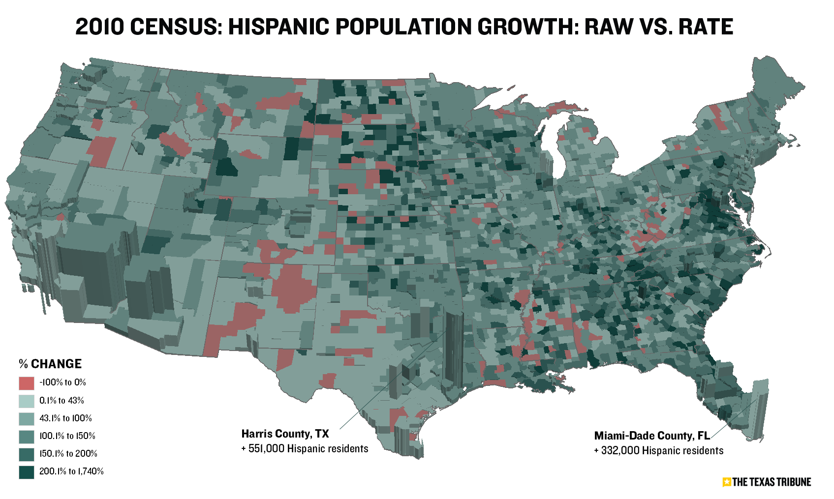
Like Texas, the nation saw divergent growth patterns, with some counties booming and others losing population. The state also kept pace nationally in the rate of Hispanic population growth. The Texas Hispanic population increased 42 percent in the last decade. The country saw a 43 percent increase.
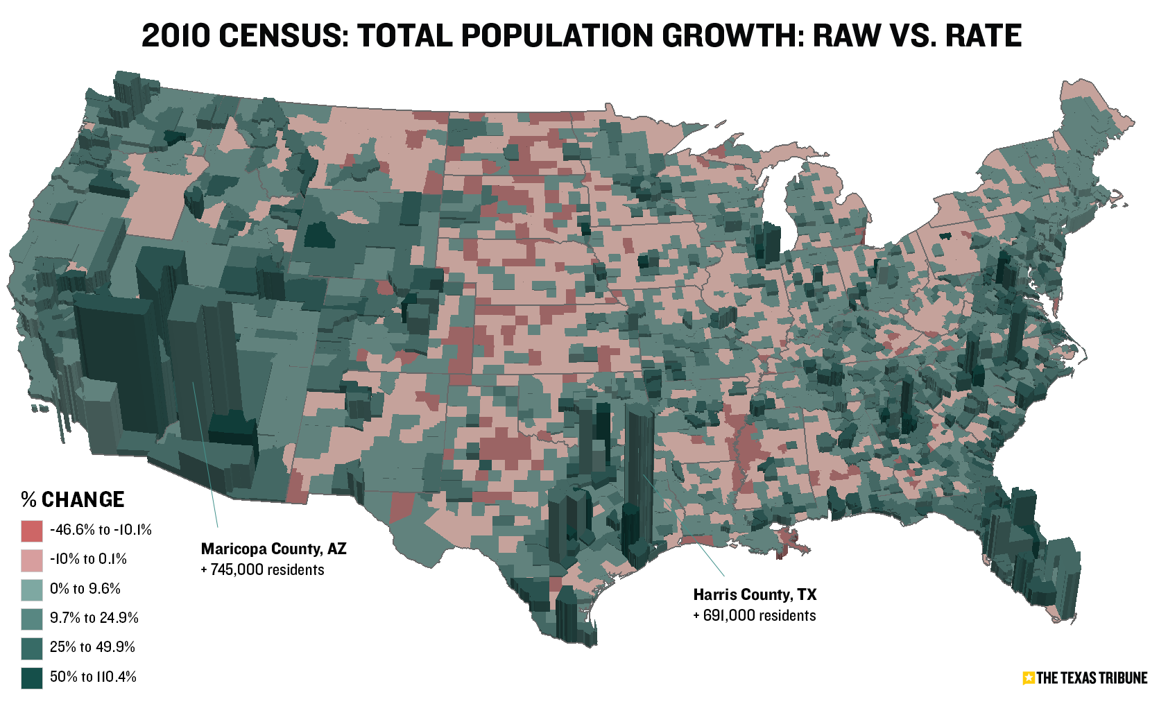
The map above shows population growth among all races in each of the more than 3,141 counties (and county equivalents). Red shades represent counties that lost population, and darker green shades represent those with higher rates of growth.
This map has a similar view but shows the rate of Hispanic growth:

I've also uploaded high-res PDF files (all population, Hispanic) and the raw data behind the maps.
UPDATE (3/26/11): I've converted these maps to 3D format. The thematic colors remain the same (darker greens represent higher growth rates; reds represent declining rates). The new 3D extrustions represent actual raw population change.
First, total population:
And Hispanic population:
Let us know if you have feedback or ideas for other data-related content, and be sure to follow @TribData on Twitter for updates.
Texas Tribune donors or members may be quoted or mentioned in our stories, or may be the subject of them. For a complete list of contributors, click here.
Information about the authors
/https://static.texastribune.org/media/profiles/TxTrib-Staff_0016_StilesMatt800.jpg)
Matt Stiles
Reporter and News Apps Editor
Learn about The Texas Tribune’s policies, including our partnership with The Trust Project to increase transparency in news.