


There is little room for creativity on highway signs.
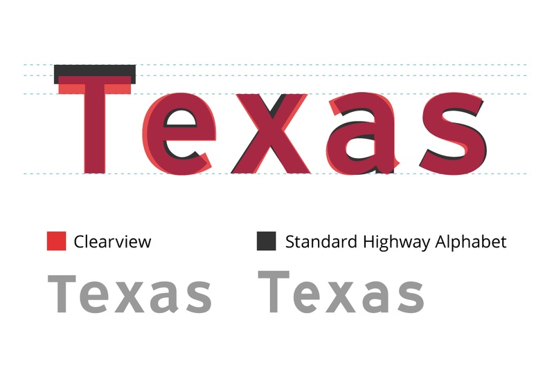
Every inch of the large metallic rectangles that decorate the Texas roadways is regulated, from their fluorescent green backing to the height of the white lettering. The typeface itself leaves little space for deviation. For years, it was Standard Highway Alphabet or the highway.
So it was a big deal in the transportation world in 2004 when Texas and a handful of other states took their signs in a different direction, opting to use Clearview, an independently designed font, instead of the federally sanctioned Standard Highway Alphabet. The Federal Highway Administration granted approval of the new typeface on an experimental basis.
Now, more than a decade later, the federal government has changed its mind.
“We’re always on the look-out for things that will make roads better, safer,” said Doug Hecox, a spokesman for the Federal Highway Administration. “In this case, what we were told is that this font was better and it didn’t prove to be. So that’s why the temporary approval was rescinded: the experiment was over.”
Yet Texas is not on board with the federal government’s reversal, handed down in January. A top Texas Department of Transportation official has sent a letter to the Highway Administration asking them to “reconsider their abrupt termination of Clearview.”
“As the world continues to change, there will remain a need to adapt and revise policies and practices to better serve all road users,” TxDOT chief engineer William Hale wrote in the Feb. 22 letter. “The FHWA must be more open-minded to improving highway signing from all aspects, including fonts.”
The Highway Administration’s decision was not made lightly, Hecox said. They had never previously considered accepting an alternative font to Standard Highway Alphabet, but Clearview came to them, “with a case to make.”
“At that point, the Federal Highway Administration had no process in place to even consider an alternative like that,” he said. “So we created this experimental process.”
While Hecox said the Highway Administration did not keep track of the states who opted to use Clearview, Donald Meeker, the creator of Clearview, estimated there are nearly 20 states who used the font on signs everywhere and 15 who used it on signs in certain cities or roadways. Texas was an early adopter.
“Texas bought in before everyone else,” said Meeker, a partner at design firm Meeker & Associates in Larchmont, New York. “Texas and Pennsylvania. They saw a difference and they said, ‘This is great.’ Because they understand the problem.”
TxDOT spokesman Bob Kaufman said research indicates the use of Clearview is “appropriate” for highway signs, but that Texas “will certainly comply with the law.”
The Highway Administration’s rejection of Clearview does not mean Texas will have to immediately replace any signs installed over the last decade. Current signs in Clearview will continue directing drivers until they need to be replaced. New signs and those printed to replace outdated or damaged ones will need to be printed with the Standard Highway Alphabet under the federal government’s newer guidelines.
This is the same process states used when initially switching to Clearview, keeping older signs baring Standard Highway Alphabet in place, but using Clearview when producing any new signs.
TxDOT spokesman Mark Cross said Texas opted to adopt Clearview after reviewing research studies highlighting its benefits over Standard Highway Alphabet. Cross pointed to a 2006 study conducted by the Texas A&M Transportation Institute that found, “The use of the Clearview font can improve sign legibility and reading time substantially without increasing the size of the sign.”
The TTI findings mirror those from studies Meeker and his design team oversaw before releasing the font. Meeker said he designed Clearview with the intention of improving sign clarity for drivers in a variety of weather conditions. He said the font has numerous features that make it ideal for roadside markers – including wider spaces between each letter.
“This makes the roads safer,” Meeker said. “It’s designed for figure-field relationships, which means the space around and inside the type is as important as the letters are.”
Meeker pointed to the formation of the letters A, E and S – “the most difficult letters” to make out from afar – as strong selling points for the font.
“In Helvetica or Ariel, you’ll see how the S or the A curves back on itself,” Meeker said. “For an older driver, that return makes the S look like an 8.” In Clearview, those letters are far easier to discern, he said.

Yet later research conducted by TTI after the font had been approved on a temporary basis undermined that original assessment.
“We were told (Clearview) would be something that would improve nighttime or low light visibility,” Hecox said. “Initially, that seemed to be the case, which is why we got very excited. But, in subsequent tests in the years that followed, we learned that it wasn’t the font at all.”
Hecox said researchers found the improved visibility actually came from a new plastic laminate placed on the front of signs to protect them from rain or rocks that may get kicked up from the roadway. Hecox said the covering improved the signs’ reflectivity and therefore made them brighter and easier to read.
Meeker maintains that Clearview improves drivers’ ability to read highway signs faster and from farther away, although it may not lend itself to other uses.
“As a text typeface, it’s really kind of an odd duck,” Meeker said. “You wouldn’t send a letter to grandma in that because it would look a little goofy. From a distance, it looks really crisp and clear.”
Despite the outcome of the Clearview experiment, Hecox said the Highway Administration would be open to testing another font in the future.
“If there is somebody out there creating a font that’s going to be great, we’re open to it,” he said. “Let’s take a look.”
Disclosure: Texas A&M University is a corporate sponsor of The Texas Tribune. A complete list of Tribune donors and sponsors can be viewed here.

Learn about The Texas Tribune’s policies, including our partnership with The Trust Project to increase transparency in news.


